The secret is out – mobile Internet usage is growing. Mobile devices are more powerful than ever before, provide a number of features, and are more interconnected than any other. Below are several mobile web design best practices to help increase your share of the mobile Internet market in 2014.
-
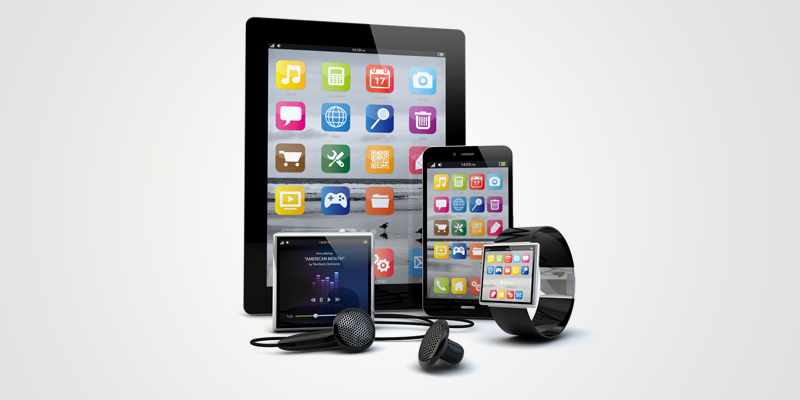
Apps
2013 will be the year of mobile apps. Mobile applications enable Internet users to get information quickly in a form that is specifically designed for cell phones. Creating a mobile application may help boost business efforts in multiple ways – revenue generation, advertising, and more intensive customer engagement.
-
Target Keywords
When people search for information on their phone, how many words are they willing to type in? Generally speaking, less than three. The inconvenience of typing with one’s thumbs makes mobile searches more “lazy” resulting in the need for mobile targeting to have short, concise keywords and keyword phrases.
-
Search Engine Optimization(SEO)
. Mobile users are more likely to search for local searches because they are more likely to be on the go. This means that you should optimize your site for local search.
-
Networks
The concept of being connected to all people at all times has surely changed the way companies market themselves. Social media marketing has become a must for businesses looking to establish and maintain their web footprint. Having social buttons, especially for websites viewed on a mobile phone, is important. Most people are connected to social media via their mobile devices, simply because social apps are an easy way to keep in touch with multiple people. This gives you the opportunity to, in turn, connect with those who matter to you the most – customers.
-
for Mobile
Google has specific mobile settings for analytics. As the competition stiffens, mobile traffic analyses will become increasingly important for businesses. Analytics data is used to help track the keywords that your business targets (or should) and monitor the type, location, and interactions of mobile Internet traffic to your website.
-
Click Through Rates (CTR)
Reducing your click through rate (CTR), is oddly a good thing when it comes to users browsing from a mobile device. Generally speaking, users want to find the information for which they are looking within three or four clicks. However, mobile device users expect instant gratification, meaning three or four clicks may often be too much.
-
mobile website
This is by far the most important thing about mobile optimization in 2013. Although most smartphones have web browsers capable of rendering full scale websites, limited wireless Internet speeds result in substantially longer download times. This makes the benefit of responsive website designs to be limited to websites that are already lightweight. Also, many wireless devices, such as Apple’s iPhone, lack the functionality of rendering proprietary multimedia such as Microsoft’s Silverlight and Adobe Flash.
Some of these tips for mobile website design in 2013 could also be tips you use for your full-scale website. When it comes to mobile Internet and user engagement, focusing on the details are a must.